Showing posts with label Urban Design. Show all posts

Monday, April 2, 2012

Of Glass Boxes and Glass Slippers

One of the tragic things working in Dallas is the amount of people and effort trying to make things work, make the city more urban, ultimately giving it a longer shelf life, is that there are many smart people trying to make little changes within a fundamentally broken ship. Sardonically, we might call this rearranging deck chairs on the Titanic. However, we tide ourselves over with the comforting thought that a million (or only a dozen) small actions can lead to a tidal wave of change. The big changes to the underlying DNA of a place are just too difficult, too politically charged to even bother with, instead we'll just set the table, the linen, the silver, and the china on this one little dining table. So what the boat is headed for the iceberg of inevitability?

Perhaps neatly and accidentally summing this up is the news from the weekend that the City of Dallas, and in particular the parks department, is going to update the downtown parks masterplan. Buried within the subtext is a brief mention of two high-rises that are coming down to make room for new parks? New something. Probably not buildings. And if they are, they likely won't make money. Such is the state of downtown Dallas. Things happen by charity and subsidy because the transportation framework is stacked against downtown.
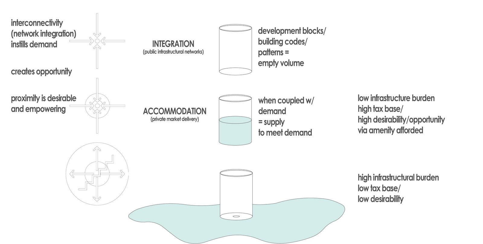
The glass is empty, so throw out the glass. Sure, the numbers don't work to fill that glass, but that isn't necessarily the fault of the glass, but the infrastructural network creating the hole in it instead.

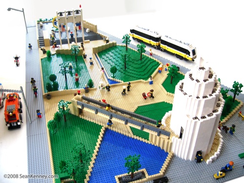
I've been saying this for a while now, but the highest and best use for downtown land is nothing. Sad to say and sorry to challenge your world view, but this is inevitable within the broken system. Thus, within that system, we rationally think that nothing or a park is better than a building. That building is empty, so take it down, of course! Demand is too low to make anything work within that building. So instead of instilling demand, we reduce supply.

I forwarded this story to someone over the weekend who responded derisively, "let's just tear down all the buildings and make a wildlife safari." Or maybe move the zoo and let jungle cats roam the streets. Highest and best use: parks and parking. Perhaps it is time to admit we're doing it wrong and systemic reform is necessary to how we think about our city, cities in general, and the underlying processes behind urbanization (or in this case, anti-urbanization).

-------------

Along these lines, Robert Wilonsky, formerly of the Observer and now mainstream at the DMN -- but still working 24/7, sent along the news that the city is seeking an operator for their first 'glass box' retail space. The glass box semi-'popup' retail space is something born of the downtown 360 plan. It creates retail space in places that currently lack it. In essence, it is giving an interface to blank walls. However, there is a catch. There must be demand before supply.

It's not a terrible idea. In fact, it is a good one. But there is a slippery slope. Again. And that is if they are used willy nilly, then they are supply side urbanism and thus doomed to fail. For the city to erect these glass box buildings is good in a few ways: (1) it eliminates some startup costs (and barriers) for a small, local business to locate in downtown Dallas. (2) It provides an interface for a buildings currently lacking one, ie a front door engaging the public realm where currently there is none, a blank wall.

It is potentially bad if these are established in places where they won't succeed, in areas of low spatial integration. Spatial integration = demand = greater chance of success, the quick wins the city and the downtown 360 plan are looking for.

So, if we're looking for a quick win for the idea of the "glass box" in micro and downtown success in macro, you'd think we'd locate the first glass box in the location where it has the highest chance of success. Since there are several potential locations for the idea of laminated retail space on a current building facade, we have to pick the place that has the highest spatial integration value. Unfortunately, that isn't Browder Plaza. Yes, it needs it, but making this phase one is the right place at the wrong time. Or wrong place at the right time. Both suffice.


BrowderStreetPlaza.JPG
I too love theoretical people in renderings. But where do they keep their wallets? Is this how we visualize tourists? As apparitions, floating amongst us, the real and true Downtowners?

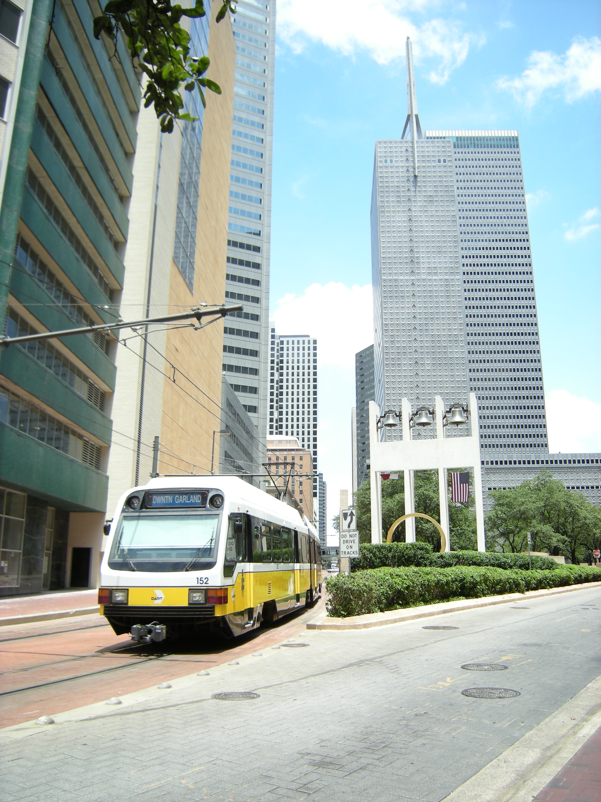
These people have to come from somewhere and that somewhere is through spatial integration. As I wrote about the McKinney Avenue Trolley last week, through movement is not nearly as important as cross movement because the people that cross the street are from the neighborhood, the street serves the neighborhood, and those are the people that populate the sidewalk and thus patronize businesses that interface with the street. Furthermore, these are return customers who keep businesses afloat.

I don't know all the decisions behind establishing the first glass box on Browder Street, a pedestrian plaza closed to car traffic, linking Elm and Jackson Streets. It very well could be that the city is trying to make retail work on Elm Street since it hasn't on its own. But that is part of the problem. It works on Main Street for a reason. There is a higher degree of integration on Main Street. Where Main and Akard meet at Pegasus Plaza is the crossroads of downtown. It is the single point of highest integration in all of downtown, its "Main & Main" corner.

There just so happens to be a perfect place on Pegasus Plaza as well:


As you can see above, the back of the Magnolia hotel fronts on Pegasus Plaza. Currently, this is a doggie dumping ground. I believe this is even a location picked out by the downtown 360 plan for retail lamination. Placing phase 1 here would build on the success already of Main Street rather than trying to expand that success beyond its natural boundaries. Those boundaries are Elm, Commerce, Field, and Ervay currently.

I'm the first to say we have to build outwards upon Main's success, but that can't be done without addressing Elm and Commerce's natural barrier effect. Much like rivers can't be crossed without fords or bridges, a river of cars is also a barrier to crossing, thus decreasing spatial integration. Meaning less pedestrians, less value.

City has added brick to the sidewalks on Commerce, but has spent nor done anything to actually change the functionality, the integration, of the street. The street is not narrowed, calmed, nor slowed. A center of gravity is not made. It is simply an aesthetic treatment, ie the least important thing you can do if you're really, really trying to catalyze change. Along those lines with the RFQ, the city is spending $500K to pretty up the concrete heavy Browder Plaza. Again, as with all superficial treatments, without first upping the degree of integration, cost significantly outweighs returns.

Now it could be that Commerce is ready for something there, but it is a gamble. Not the sure thing, nor quick win it is being espoused as. This may be a timing issue in conjunction with Forest City delivering more units further down Commerce, however the gravitational pull will remain Main Street as long as Elm and Commerce exist as they do, as escape routes. Places to save time rather than spend time.

The second problem here, is that there is a good chance this is the city picking and choosing winners. I'm no fundamentalist libertarian, but it is rarely a good thing. The public agency is better off focusing on instilling demand through the establishment of a transportation network that is about clustering. That is about demand, rather than about moving people out. Rather than instilling demand, the city is adding supply of new restaurants by funding the startup costs in essence within an area that is likely maxed out on restaurant/entertainment/retail space.

I have no data, just experience living in downtown, but I get the sense that the integration increment DART added to downtown has maxed out. Downtown is what it is now, rather than what it was nearly dead in 2000, because of DART. If we are indeed maxed out, new retail space cannibalizes from existing retail space. From living and being in downtown every day, and experiencing the evolution, it certainly seems like what is happening. One new place opens, another closes.

All of these issues, point towards an economic development program that is better aligned with urban design, and vice versa. I get the sense that they are aligned, just misguided currently. Integration begets accommodation (and decoration). Merely adding accommodation (and decoration) via a variety of incentive packages is spending to get minor successes. The solution is right in many ways, but the superficiality, the supply-sidedness of it, undermines the effort towards quick wins.

Alas, the glass slipper is still just a pumpkin.

Post Script:

Big Jon Daniel asked on twitter if this is a shot by the city "across the bow of food trucks." I don't think that is it at all. In fact, one of the food truck operators would probably be an ideal operator for the first (or any subsequent) glass boxes. Food trucks started because of the reduced startup costs in conjunction with the poor locational efficiency of the majority of the city. Simply put, entrepreneurs couldn't locate in the appropriate spots due to a variety of cost barriers, both real estate and operational.

Speaking for the food trucks, I would expect some would like to grow and expand their business. Many would like to grow up and have ambitions of a permanent establishment. If one of the food trucks moved in to the glass box, that would allow the laminated retail space to operate as a supply depot for the truck. At night, it could even park adjacent along the street and create a little cluster effect between the restaurant and the truck (particularly if the two filled separate culinary niches). Of course, that would mean parking on Commerce Street, altering its traffic flow patterns (God forbid!) and thus, another good idea dies a premature death.


Monday, December 6, 2010

Thanksgiving Square: Speed Bump


DO NOT ENTER

A colleague and I have a joke. One that will no doubt leave you not laughing, but inwardly snickering at our silly professional humor. It goes something like this, "what do you do if you can't design a road properly? You add speed bumps." Hilarious, I know.

If you can't cry all there is left to do is laugh, right?

The point of the joke is that drivers will always drive at the speed that they feel comfortable and safe driving. The bumps imply that there is motivation to slow traffic for whatever reason, but the traffic engineering manual doesn't know how to design for calm traffic speeds so we must add regulation (signage with speed limits), enforcement (cops sitting in a car), and if all else fails, structural impediments (such as speed bumps).

It is with that said that I bring up Thanksgiving Square in downtown Dallas. Having recently relocated from the Interurban Building to the Mosaic, the park is now in sight and on the mind daily. Furthermore, it is my understanding that the city of Dallas is trying to figure out what to do with 1600 Pacific, an ominous looking black glass 60s era office tower. The tower sits on Thanksgiving Square, emptied out and went bankrupt last summer, and has had some teases of new development floated across the news wire. I haven't seen anybody working on it at all however.


The point of this post is to express that the design of Thanksgiving Square is a speed bump slowing down an entire portion of downtown Dallas from investment and densification. If the city wants to reinvigorate 1600 Pacific, surely there are economic partnerships in the works, but numbers alone will not ensure success. Thanksgiving Square must be reversed from a negative attractor, repelling people, to a center of gravity drawing people and investment.

As speed bumps are a sign of poorly calibrated road design to the needs of an area, as are public parks that are closed and gated at 5 pm. This is the case with Thanksgiving Square. Contrast this with other public spaces in downtown: Main Street Gardens and AT&T Plaza, which had to remove the bus 'bunkers' to make it an attractive, successful public plaza. It removed visual impediments creating a safer environment. Thanksgiving Square lacks both physical and visual porosity necessary in making a public space successful.

Let me also state that I'm really not interested in the history, politics, or ownership of Thanksgiving Square. The purpose of this post is not to figure out how to solve the potential maze of hamstrings and red tape from making a vibrant plaza, but to point out the physical flaws in the public space. They are there and identifiable. Whatever nostalgia or attachment we might have had to the process that created the park must be forgotten for the sake of bettering and enlivening downtown Dallas.

A successful city creates an environment where density equals desirability, in that the provision of space is enough to satisfy the demand to be there, without hindering that demand (i.e. a giant building might be overbearing - or in this case, the towers along the southern edge ensure that the Square is nearly always in shade). The majority of space around Thanksgiving Square, like 1600 Pacific, is dead, dying, or on life support (heavily subsidized). Certainly there are macro-design elements effecting the general desirability and well-being of downtown (highways), but from the micro-sense, why are some areas of downtown more successful than the cluster around Thanksgiving Square?
----------------------------------------------------
The park was designed by Philip Johnson who, along with I.M. Pei, probably did far more harm to downtown's health and vitality than they ever imagined or intended. But what's an architect to do? The client is the boss, right? Concrete and grade changes, typical of the time of design, are not just ever present, but bold, as if the idea needed to be extruded to cartoonish proportions just like Johnson's other buildings: the Crescent and what is now known as Comerica Tower (which will surely have five more names of whatever bank such-and-such over the next few years).


Thanksgiving Square leaves one with the sense that it was designed as a place of respite to get away from the 1970's downtown Dallas that was still quite busy, perhaps even oppressively so. And that would be fine, cities need places to get away. However, how do you reconcile the intentions for peace and quiet with its design as an interchange between levels, a hub between below-grade tunnels and at-grade street activity?

When the park is open during any work day, it is predominantly used by smokers as they are shoved increasingly further away from any public building or entrance and for the occasional dog walkers as there are two large residential buildings adjacent to the Square: the Mosaic and Gables Republic Tower.

The dogs crap in the expansive spottily emerald shards of grass only to be occasionally cleaned up by the owners. We've discussed the issues of cleaning up after dogs extensively on these pages, which is only exacerbated by the lack of visual permeability to and thru the park. When people aren't being seen, some may not live up to the standards society imposes upon them.

I have a perhaps unnatural aversion to turf grass in urban settings. In places like this that are sloped and heavily treed, it often doesn't grow well. It is a maintenance nightmare that most be mowed constantly as well as cleaned as it attracts trash, cigarette butts, and dog shit. I generally only believe in using grass in open lawns that are usable for free-form activities, playing, picnics, etc. Grass because you couldn't think what else to do with the plane is generally a bad idea.

However, this also is not the greatest offense by Thanksgiving Square. It should be wanted for murder, because it kills everything around it. Let's look:


- First, is the transportation network, which is limited, and in turn limits the life of the square. Pacific, running along the southern border of the square is one-way. If you believe in my concept of convergence or Space Syntax/Bill Hillier's idea of centrality of networks, you know this limits the amount of activity around the space. Pacific is also mostly used only by cabbies who know their way around downtown and since they are stuck on one-way couplets use it as a U-turn.

Furthermore, along the north side is the DART line, which is for DART only, but this doesn't stop the confused driver from turning down it daily only to be honked at by a DART train. Since it is for only DART, this also limits the amount of traffic moving past the site, only compounded by DART not stopping on this particular block.


- Squiggly orange lines represent pedestrian ways that break up the Dallas super blocks. These would be necessary and well used if they were direct and the destination more visible. Instead there are vertical circulation escalators to get to the sky bridges and tunnels in the way, as you see. I'm not sure I've ever seen these open, let alone used. They should all be removed similar to the bus 'bunkers' to increase sightlines and perceived safety.


(the DART corridor - there might be a pedestrian or two here if they had any reason to be on this portion of sidewalk)

The streets to the east and west are the Akard-Ervay one-way couplets, which provide the majority of north-south pedestrian movement in the immediate vicinity.

- The solid red squares represent access to parking garages. These interrupt the pedestrian network as well as occupy potential development space that would participate in the urban fabric rather than subtract from it as garages do.


- The thick, fuzzy red lines represent walls. Walls are nearly always detrimental to street life. Even worse when they are blank and taller than a person. Even even (sic) worse when these walls aren't broken often for points of access. Walls create a border vaccuum condition which from an urban perspective, repels activity, which heads towards centers of gravity, the centrality of networks, nodes. This is not to be confused with people preferring to hang out near edges of spaces, rather than stand in the center of spaces. Call it the meso- vs. micro-spatial preference of people. For people to gather around the edges, first an attractive space or outdoor room, a center of gravity has to be created.


- In the orange shade, I'm showing the two residential towers I mentioned previously. If I were to guess, there are probably in the neighborhood of 6-700 units between the two buildings, which, along with the office population, should help support ground floor businesses.

*For the sake of argument here, we'll also ignore the drastic grade to traverse between street and tunnel as well as the tunnels siphoning commerce and vitality from the street.

- I've also outlined the ground floor uses around the square and color coded them based on their relative success. Red is bad, yellow is okay, and blue is good. I had to make a few judgment calls, but I'll go through each for you to decide.

GROUND FLOOR USES (by color):

Taco Borracho: This is a new taco stand in the Mosaic building. It has people in it every time I walk by and given its physical dimensions, it must have pretty low rent. I can see this place sticking around.

Miguel's Cantina: I'm giving this a blue because it often has lunch lines out the door and down the block. Minus points for not being open weekends or after 7 pm, but its lunch success keeps it from being downgraded to yellow.


(part of Miguel's cantina and building garage access)

Beyond the Box/Office/Bank - Part of the storefront in the Republic building at Ervay and Pacific. Only Beyond the Box is a typical, active ground floor use, it also has outdoor tables, but are rarely full. Like Miguel's BtB is only open during typical working hours, but since it and its neighboring office uses have all been here for several years, they remain blue.

Republic Tower Leasing - This goes yellow despite having an attractive, maintained storefront because leasing is non-revenue generating. If somebody came along and offered the right price, I'm sure Gables would shove their leasing people into a closet.

Office - I forget what company is in the ground floor of the TXU building, but I believe it has turned over recently within the last two years. The real minus points come from the engagement between inside and outside space, with no physical porosity between the two.


Trophy Club - The gym for the Mosaic building. It was called Pulse, but recently renamed to tether to its mother brand presumably to up awareness and clientele among downtown office-types. Gyms can often make great ground floor uses if they make for the fishbowl and put aerobic machines up close to windows. It is what it is. However, there is very little to see in the configuration. Bonus points for reorienting the entrance to the street to have a real storefront within the past year.

AM/PM Lounge - This very well may go red shortly if it already hasn't. I didn't notice a crowd this weekend. I think this is closing if it already hasn't. I will have to verify before we make it red.

Entire 1600 Elm building - See the frowny face on the diagram

Below - Once upon a time this was a soul food joint that was pretty good. It relocated here from another location, then I believe it changed ownerships before dying a swift death, like a guillotine.


Asia Wok building - This restaurant has been dead for about 8 years. The building has been entirely empty (with the exception of a little bodega on the Elm side) for even longer. It has changed hands about a half dozen times, each promising to restore it to health...if only they could figure out the parking!


Backbeat Cafe, formerly known as Opening Bell Coffee, and even before that as Standard and Pours. This closed within the last two weeks and sits as you see it.


Vacant corner space in Mosaic


It is important to not the pattern. The closer to Akard/Ervay, the better chance of success because there is more traffic, foot and car. Until Thanksgiving Square is a more usable space, there will be no reason to venture into these blocks.
------------------------------------------


The transportation is a bit tricky due to lack of space, but the other solutions are obvious. First, the perimeter walls all need to be lowered to sitting height, broken more frequently to allow more access points, and the access points that DO exist need to be opened up to be more friendly by designing them to be welcoming sub-spaces to Thanksgiving Square that attract people to sit and hang out (remember people like to be at edges of spaces).

Here is a quick sampling of the walls and entries as they exist around Thanksgiving Square:


My personal favorite. What exactly are those shrubs doing there except to convince people NOT to enter?


This wall runs the entire length of the block without break.


On the north side is the rare "double wall" to allow daylight into the tunnels, or a convenient place to toss your bottle of Schnapp's.


While lowering walls which very well may eliminate some of the trees around the edges of the parks is a pretty significant undertaking, one solution that isn't is a complete redesign of the 'point' of the park. Right now it is a garnish, as you see.


Bizarrely, there is useless grass and useless shrubs as if whoever planted them thought, "this will cover up our mistakes" with signs that say, "keep off the grass."

Even this lego model ignored the point:


Here you see it in action, or inaction:


This point should be turned into an outdoor seating plaza to be shared amongst all of the potential restaurants and ground floor uses that currently occupy space nearby such as Miguel's, AM/PM, and Taco Borracho as well as the future uses that might move in. This would immediately make part of Thanksgiving Square more active, a central part of the outdoor room created by the building walls. It should have access back to the main part of Thanksgiving Square to allow the option of eating in a more serene setting as Thanksgiving Square is intended or you can stay out in the new cafe seating if you want more hustle and bustle and to "see and be seen."

Below is a before and after of Pearl Street triangle in New York City. Instead of going from parking to park, we would be transforming a part of Thanksgiving Square from useless green to useful, and green in that it helps to revitalize the downtown core.


I am not even suggesting radical change to the interior design of the park, but the issues at the edges are fundamental to successful public space and must be addressed. Until we transform Thanksgiving Square, it will remain a speed bump, slowing efforts to revitalize downtown Dallas.

Thursday, October 7, 2010

WalkableDFW Field Trip: Vancouver


(dozens of photos to follow if you can follow along...)

Recently, I had the chance to visit Vancouver for the first time in my life without the digital aid of google earth. I was visiting friends in Seattle, a city I have been to about a dozen times for bidness (sic), but selfishly I finagled a group day trip up to Vancouver. In GE, I've probably been there 1000x time, but you never know a place until you can actually see how people interact with the place. GE is good for elucidating long-term processes and dynamics of cities, where people live, where investment is happening (or happened, and when), where successful (or failing) shopping districts/corridors are, etc.

This is one necessary way of seeing a city, but the other is very much in the William Whyte/Jane Jacobs school of observation and empiricism, profoundly scientific at its core. This is also why there is more to learn about cities and urban design through those two, as well as the physical, social, and computer sciences. Each at their heart, some measure of physics at work in their networking dynamics.

This is also why you might as well throw anything architects say about a city out the window. Typically too engaged in window dressing or theoretical and rhetorical gymnastics to "litter the world" with their selfish aesthetic purview. This is a bit harsh and painting with a broad brush myself, but also why so many starchitects make zero sense when you really analyze their words closely. They've made a profession of talking wealthy clients into a dizzying trance. "Wow, I have no idea what you just said, you must be smart."

What does this have to do with Vancouver? Well, it is a city where historic urban fabric and modernism collide, but skillfully and often subtly. Occasionally the contrast of hyper modern and historic can be striking, but struck too often, and your senses are dulled into a vegetative state of a teenager overwhelmed by "flashes" or "jolts" watching MTV. Literally, there are studies about how many "jolts" (a sudden bright image or loud sound) a human can take per second or minute. MTV began this and many other television networks followed suit. They literally and often intentionally turned us into couch potatoes. Tune in, zone out, absorb advertising comin' atcha!

The (rhetorical) question is what demands more out of the user? That which makes our brain tune out or is easily accepted, or that which requires some work on our part, to decipher and interpret. I choose that latter and frankly, if we accept that cities are an exercise in social engineering to some extent, a certain amount of paternalism is necessary. Recall the quote from so many people now that it's lost its attribution that, "we shape our cities and therefore they shape us." Do we expect more out of our audience or less. Do we expect more out of our citizens in daily life? Or school kids just let out of class and back into the city? Or do we just assume they'll wreak havoc. Expectations. People live up (or down) to them.

I believe the most genius is to be found in subtlety. Anybody can ram two tonka trucks together and make them crash, but how many people can split an atom? In many ways, this is what Vancouver has successfully done. Nearly every inch of the city has been spoken for, designed. Perhaps, not by real designers, but like any highly lived in and cared for place, it has been molded by the users. Enough users, enough decision makers, the more place changers. The more people, the more pressure is exerted on that city. Are they there by choice or forced to be there?

This ends up being a key factor in successful cities/places and their livability. How many people are there above those that have to be there. Many people say Dallas is importing people because there are jobs here and not jobs in other parts of the country. Those classify as people who are here by need, not desire. Those needs eventually evaporate and can't be counted on forever. People go to (or stay in) Vancouver because they want to be there to a much greater increment than Dallas, I would surmise. Furthermore, we can look at this from a city vs. suburb scale or even micro: one public space vs. another, even within the same neighborhood. Why does one work and not the other? All of the elements in the equation have to be spliced apart to understand the reasoning properly if never quite fully.


I don't want this to be a "OMG Vancouver super awesome brah, up top!" type of post. I also don't want it to be overly affected by the absurdly nice weather we happened upon in the PacNW. If it were 75 and sunny everyday, would anybody live anywhere else? I dunno. It is why you'll see me working from outside almost every day here in Dallas this fall. /Dallas weather sucks! Nobody wants to be outside. Ok. Thanks for the tweet Ms. Postrel.
Side note: I'm amazed how nice Seattle weather has been every time I've been up there. If I didn't know better, I would think there was some Greenland/Iceland Viking 3-card monte going on.
I found there to be two Vancouvers. The Vancouver that you see from afar (take that literally or metaphorically) and the Vancouver experienced on the street. The latter is by far the more intricate, complete, and complex. And that very well might be the best possible outcome for the two disparate vantage points. From afar, you're looking for beauty, coherence. In person, challenging and stimulating activity, the kind of density of activity and connectivity that creates gravitation, places people want to be just to be. Remember, we like to watch people (also why you'll find most people in any space clustering around the edges).

This post is going to focus on the why and the how for that phenomenon, why Vancouver is so heralded these days, and why it generated the kind of buzz that buys Olympic bids (not literally, ahem SLC and ATL /sideways eyes).

I've mentioned these points in various previous posts, but it is always worth restating. Vancouver has a few main things going for it:
  1. Dramatic yet constrictive geography - almost an equivalent of urban growth boundaries, except to the South where there is ample, flat, arable land.
  2. '90s Asian investment seeking financial security and potential growth during lost domestic decade
  3. '60s era decision by Vancouver policymakers not to allow highways into the city...and diligence/perseverence sticking to it
The last has probably been the most important and influential over the long-term in spite of what I presume were some naysayers calling the decisions "backwards." In reality, it was probably a defensive maneuver or perhaps a calculated risk, but one that has paid large dividends.

Much like Copenhagen, the process in creating cities hailed today as some of the most livable in the world began in the 60s. Copenhagen removed cars from streets incrementally, Portland under a republican state governor established urban growth boundaries to preserve agricultural and natural land, Vancouver decided freeways were antithetical to what cities are about, neighborhood livability, commercial vitality, and interconnectivity.

The common argument for highways is that they improve connectivity and trade, because of fast moving traffic, but do they? Well, we know that answer. On a regional scale they do, linking regional economies, say in this case Seattle-Vancouver (with that one big barrier in between), but they cause more harm to connectivity on the neighborhood and city scale, the local economy.

CEOs for Cities recently issued a scathing critique of the Texas Transportation Institute's basic formulae. The report entitled Driven Apart shows the limitations if not instilled biases towards increased highway construction. The mobility index is all about speed rather than distance. If I'm driving fast, traffic is clear, things are moving, all is well. Except, 1) that doesn't take into account negative effects, and 2) if it is based solely on velocity rather than a)mode b)efficiency c)pollution d)real estate effects or e)proximity, it is immediately biased towards providing more and more highway travel lanes. Taxpayer, you're on the hook, indefinitely, cuz those things don't maintain themselves.

The natural response is that traffic must be hell, particularly entering the city. There were three traffic backups delaying what should have been little more than a two-hour drive, none of which were directly related to the scaling down of streets (because capacity is added by the grid, the entirety of the system). The first was the border crossing. The second, was through a tunnel which inexplicably was closed down to one lane. And the third was for construction of townhomes along the arterial once into the city, yes, right along what otherwise would have been a highway. Smaller road = more private investment, better balance between taxbase and infrastructure.

The reality is that it isn't bad if the people don't follow the parasitic straw of highways outward as well. They remain close in to the city where all other forms of transportation are viable if not preferable for some percentage of trips. We'll look at why later.

Here is a sequence of the "highway" approach to Vancouver:


Entering the residential periphery the highway steps down in classification to a six-lane signalized arterial. Highway speeds are incompatible with the neighborhoods, but it maintains capacity (if not increases it as cars slow and distances between narrow). The grid then allows for pressure release and increasing choice of route as you enter more density (of destinations).
sidenote: You could say, well why not just build a highway bypass? But, why would you want people to bypass your city? More of a philosophical debate there than a pragmatic one, but a question that should be asked.

Now, in a more robust grid (more optional routes), we are down to four total lanes. Furthermore, part of the denser grid, is shorter blocks, and more intersections which further slows traffic, becoming more compatible with more and more people, i.e. residential density.


And next thing you know, you're crossing bridges into the city, which looks almost exactly as you imagine it, populated by 20-story blue-gray glass towers.
-------------------------------------

Stepping back to the TTI formula/CEOsForCities critique for a second, if I walk across the street to the store, I am moving more slowly than somebody who drives to the nearest Kroger or wherever, but which is actually more expedient, more efficient (energy or otherwise), or more enjoyable?

None of these questions are asked by TTI, but they are precisely the ones that must be asked within cities, which have an infinite array of factors that must be considered. TTI would do so, except that might dry up the highway trust fund and their personal crusade (for whatever ends) is over. Some of those questions are rhetorical, others are subjective, which is exactly what makes for livable cities, choice and the full and at least equal ramifications for individuals to decide.

TTI, whose data is essentially the be all and end all for all transportation choices, is absurdly flawed. Without competing metrics and proper application of values, the decision is always, "huh, I say I say I say, guess we need mo' highways."

What the highways do in practice to residential real estate markets is move the tipping point between cheaper land (an amenity) and the amenity of proximity: to goods, services, jobs, etc. When you live closer, you don't have to drive 60 miles per hour to get everywhere, and the resultant urban form is at a slower, more humanly acceptable pace, yet better connected, and frankly faster and more cost efficient for both user (less transportation cost) and city (less infrastructure cost - which is translated into taxes).

When land, fuel, and commuting time costs are so low, it is almost insane not to buy a big ol' house at the edge. Everybody heads out there. It happened in Dallas. Tax base headed north. It stuck around in Vancouver because there was more advantage (and presumably long-term return on investment) to stay close even if it meant a smaller home or less square-footage per person.

There is another emerging facet of this equation, the down-sizing movement around the country with regards to house size, moving back into what some might consider more cramped quarters, closer to the city, not for reasons often mentioned, but with the explicit intention to become closer as a family. Rather than Sally texting, tweeting, facebooking, and chatting up in the fourth bedroom, roughly three miles from the "living room" where Mom and Dad are huddled around the suburban campfire, the television, the family is forced into constant interaction. While we may occasionally hate family, the socialization, forces us to become more, ahem, socialized, more tolerant of others and less withdrawn from anyone other than ourselves.

This is the same concept with design, the more interaction, the greater decisions per amount of time occur, applying an upward design or usability pressure to a(ny) place.

I see this locally in downtown Dallas, where new residents are looking to get out from within their cocoon. Their loft is their bedroom, but their living room is the city, out with others. We are social creatures. Uptown is still mostly graduated suburbanites yet unready to find themselves, instead more comfortable letting their dogs greet strangers through the funniest way imaginable, butt-sniffing.

But enough tangent tripping and back to the photos...


The first area we entered was in and around a neighborhood known as Yaletown, which was wonderfully low-scaled and intimate for the most part; the kind of place that looked like they've been lived in and occupied for years, adapted for and by the citizens.


A locally adapted detail here. There is a clear plexiglass panel within this awning. It does two things, allows more light because of the all the gray, dreary days and covers the outdoor eating/sitting area from the rain. How many things do we have here that are designed specifically for Dallas? Or Texas? Many seem as though they could be anywhere in the world.


Now, to planner porn. When former city planning director Larry Beasley was in Dallas last, he seemed to want to get away from what Vancouver is best known for in architecture and planning circles, the point-tower. What this means is a podium base that never gets much taller than four or so stories, with a tower rising from the middle of this base.

The intention is that from the street, the pedestrian never feels overwhelmed by the scale and height of the building. Other unintended consequences of tall buildings include wind shear (creating extreme wind gusts below) and a privatization of the sun to some extent, creating an overly shaded street. In cities where the sun is rare, it is critical to prevent this from occurring. In Dallas, we just make every building reflective glass to amplify ambient temperatures ten or fifteen degrees at the street. Smart. (But, we're being super green dude!)

What Vancouver did, was essentially establish invisible volumes that when investment arrived at various blocks it would fill up the "glass" as construction of buildings deemed suitable and complementary to the street and adjacent blocks. My guess is that this solution was a compromise. Because there were no highways into the city, there was no sociofugal force that scattered and gutted the city that had incrementally formed and clustered over decades and centuries.

Because nobody had left, there was no incentive to pave and park. The citizens were happy with their city the way it was, and to accommodate this new asian investment (who wouldn't turn down that kind of money?!). The City HAD to find an acceptable compromise between (Far) East and (Pacific North-)West, between investment demanding increased density, and all of the historic fabric.

Here is a series of those:


Two-story base. Notice the rooftop garden spilling over.


The same building. It has some art deco things going on to it. I can't tell if it is new or old, which tells me it either is aging or will age well.


Here is another base of a tower, a series of townhomes and stoops lining the quieter side street. The is density interfacing with public space with extreme delicacy.


On the surface, Vancouver is all about those shimmering, elegant glass towers. The life of the city is still at the street, just as Jan Gehl suggested when he blamed too many cities and architects focusing on skylines rather than sidewalks. Vancouver tried to bridge the gap between the two, and while they did so to accommodate density, there is still more density in dreadfully un-urban Las Vegas.

While I got the impression that many of these towers were little more than arm candy, staring back blankly and dumb, perhaps that is the only way to make building height work with the ground plane. The towers are meant to be seen from afar, the ground plane is meant to be interacted with, touched, felt, and interfaced. It was necessarily more human. In Dallas, we plop down a porte cochere and valet stand. But interface is partially the fault of road design.

This is why you can't get into the density debate. Much of Las Vegas is more dense than Vancouver, far more people live in the intricate, tightly knit surrounding neighborhoods in Vancouver than the glass towers, which are filled like many other recent condo towers, with speculators and second-, third-, or fourth-home buyers. Rather, we must maintain urbanism as an issue of design. Not design as most see it, the superficial and subjective, but rather the objective: design function and relationships between buildings, streets, and spaces.

The rest of the city:


You'll notice sometimes I tilt the camera to get more into the frame, usually the horizon.


I have no idea what kind of building this is. It was across from the convention center (which isn't the beached whale the same facility is here).


Every side street, turns the corner and immediately changes character from hustling/bustling to residential scale/proportion. Notice the baby carriage. Downtown Vancouver actually has a dearth of schools (and space to put them). So many young families moved downtown in the past 15 or so years, that they have not been able to keep up.

Of course, everybody will tell you only young singles and empty nesters will live downtown. They are full of shit. New York City is having the same problem in lower Manhattan. Once again it is about desirability and safety, aka design.


Granville Island:


See the entry bridge into the city from earlier in the post. Same one. Interesting here, because it is so high that it doesn't have the negative effect many bridges, viaducts, and highways have on the desirability of the ground plane. New TxDOT campaign: Raise all the freeways! Just kidding. Or we could go all Le Corbusier and put them on top of buildings.


Kid spray park on Granville. Amazing how many amenities for all ages are in an around the downtown area. These are chicken/egg. You can build them for nobody in hopes they come, but it is better, easier, and cheaper to respond to rising demand for amenity, by getting people to live downtown by other means, ie transportation advantages, not having highways to the burbs.


And this wouldn't be complete without a trip to the Olympic Village, which was remarkably similar to Victory in Dallas in many ways, not the least of which because they're more like ghost towns than development prototypes. I think I'll turn the rest of the Olympic Village analysis into a post of its own because it deserves it, especially after Kaid Benfield tweeted at me that it represents the new model of sustainable development. Hint: I'll disagree. The City still owes a billion in cash money on this piece, hardly sustainable. For now, enjoy the design detail, because frankly, it is pretty exquisite...


Also, I edited Seattle out of this one to make into its own post as well.